Colors are so powerful 🌈—they set the mood, carry vibes, express feelings, and can even be tied to temperature (warm, cool, or neutral)!
That’s why picking a monthly or seasonal color palette is such a joy for me. The colors you choose can completely change how your planner or journal feels. Is it warm and sunny? 🌞 Cold and rainy? 🌧️ Snowy and cozy? ❄️ Or bursting with flowers? 🌸
For September, I usually go with warm and earthy colors. Let’s have a look!
🍂 My September Palette
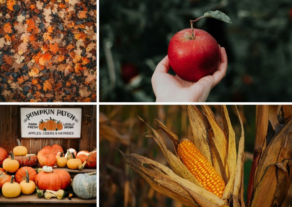
For me, September feels like a gentle shift from summer brightness into cozy autumn warmth. I picture muted greens, mustard yellow, soft browns, and a touch of rust. Together, they feel like warm tea in a favorite mug ☕, crunchy leaves underfoot 🍂, and the golden glow of shorter days ✨.
When I think of September, this is what comes to mind:
🌎 Remember: It’s Personal
Everyone sees September differently! For you, it might be about pumpkin pies cooling on the counter 🥧, or fresh linens swaying on a clothesline 🌬️. And if you’re in the Southern Hemisphere, September might mean a completely different vibe than fall! Maybe it’s all blooming flowers and bright spring skies! 🌷🌞
🎀 Know Yourself
The most important part of choosing a palette is knowing your own taste.
💗 Me? I’m a pastel gal—I love soft, muted colors that feel calm and dreamy.
💚 Maybe you prefer bold neon brights! ✨.
🖤 Or maybe your style is minimalist: crisp black, clean grays, and just one accent shade.
👉 Whatever your style, your palette should make you happy every time you open your planner or journal. It should feel like you on paper!
🎨 So, What Colors Did I Pick for September?
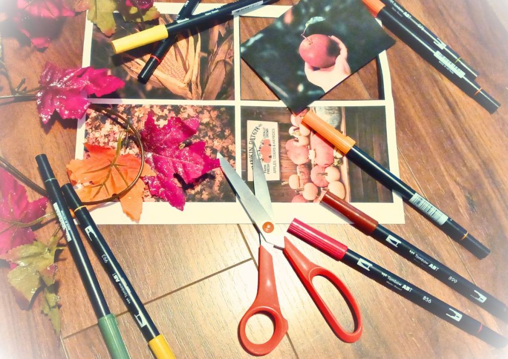
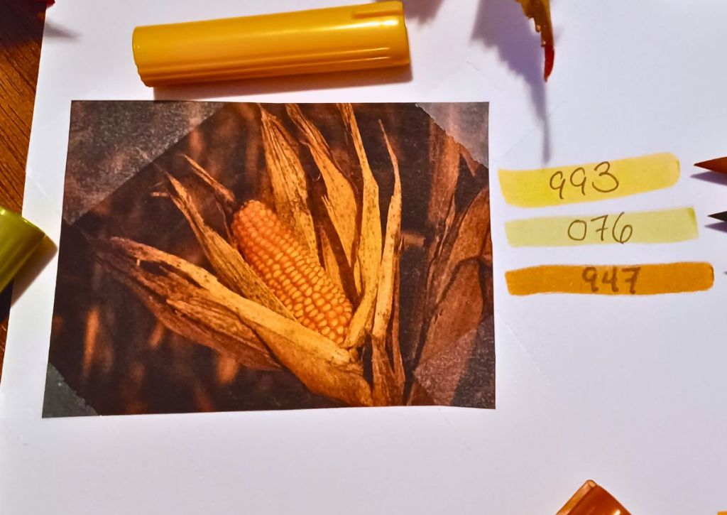
The first thing I do is print the images I’ve chosen for the season—though that step is totally optional. I just happen to be a little old-school and love the tactile experience of working with paper. ✂️📄
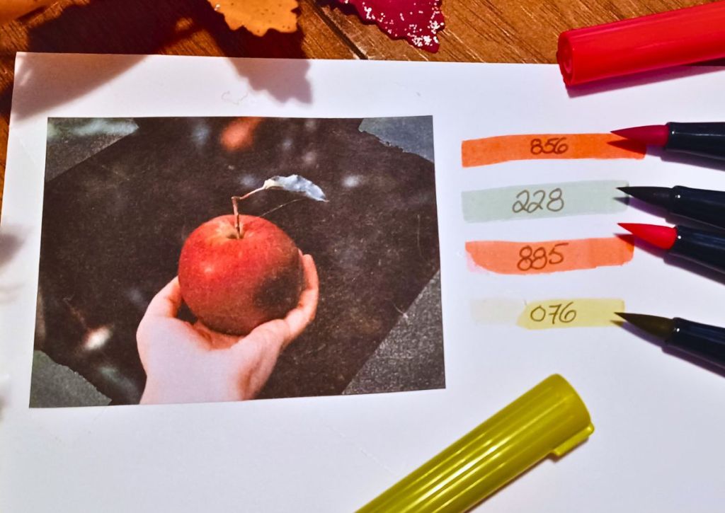
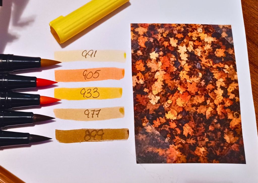
Next, I grab my Tombow markers and start pulling out shades that match the colors I notice most in the pictures.
Finally, I narrow it all down into a palette. Sometimes I choose the colors that show up the most, and sometimes I go with the ones that just call to me the loudest. 🎨✨
(If you’re curious, my September picks are: 076, 228, 856, 947, and 993!) 🌟
💡 For reference: I use Tombow markers because I love their softness, transparency, and brush tips. 🖊️💕 But you can absolutely use whatever you already have—highlighters, colored pencils, fineliners, washi tape—anything works as long as you love it! 🎀
🌸 Final Thoughts
And there you have it—my September color palette for this month’s spreads. 🎨🍂 I hope it inspires you to create a palette of your own this month!
Now I’m curious: what’s your September palette? 💛 Drop a comment below and share the colors that capture this month for you—I’d love to hear! 🖊️🍁
👉 I also added a little poll at the end of this post! I’d be so grateful for you to vote—it helps me see what you’d like me to write about!
As always, thank you for sticking around, and happy planning! 💖📒
(Promise the next post will be extra cute and maybe even a little more pastel-y 🌸🎀)
💖 Enjoyed this post? Support my stationery blog on Ko-Fi! Your tips help me keep creating cute content—and you’ll get access to exclusive rewards 🎀. https://ko-fi.com/missstickersblog






Leave a comment